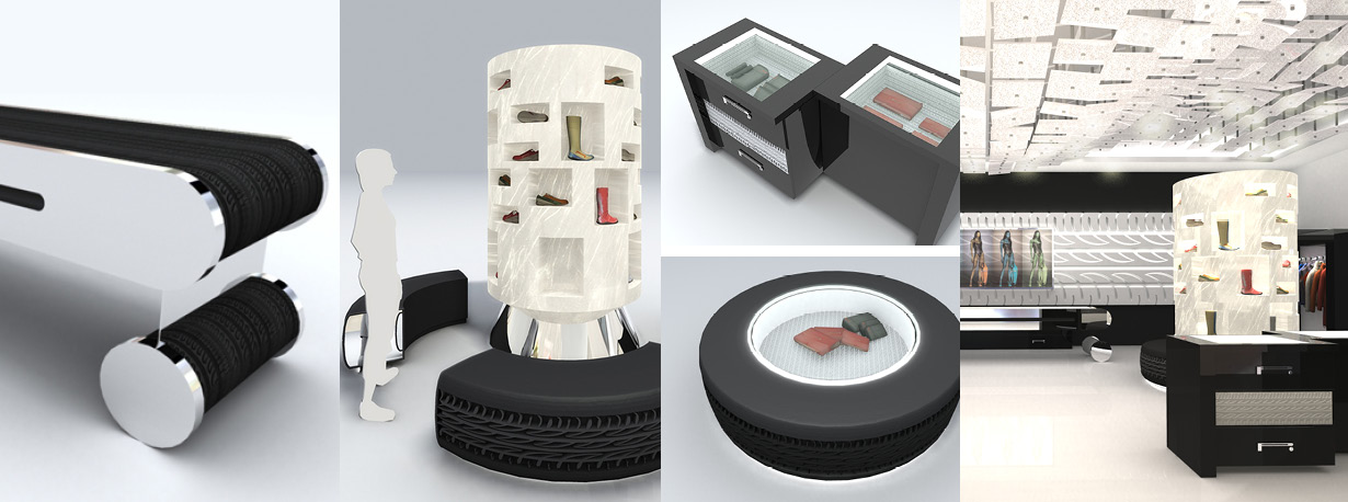
After careful analysis of the PZERo products and drawing upon the iconic symbols derived from the industrial activities of the parent company, Pirelli (tires, fiber optics...) the idea was to create a design that consistently reflects and enhances the product. The concept ‘revolves’ around the energy of “rollable” shapes and fiber optic technology; with the simplicity of a white/black/steel color scheme in contrast to the complexity of the lighting system. Special emphasis is placed on the multi-sensorial perception of the PZero atmosphere: the luminous effects, music, tactile perception of the various materials, the input of the message through film and images, all interact with the customer, who has a varied and multi-faceted experience, while waiting, receiving input, relating. The concept calls for an area reserved for cultural initiatives; the display case is interpreted as a company-client “interface” for occasionally communicating about a specific product or theme.
GET IN TOUCH
SGS Architetti Associati
via Francesco Nullo 14, 20129 Milano, Italy
T +39 02 710 402 78
F +39 02 752 801 12
info@sgsassociati.com


FOLLOW US