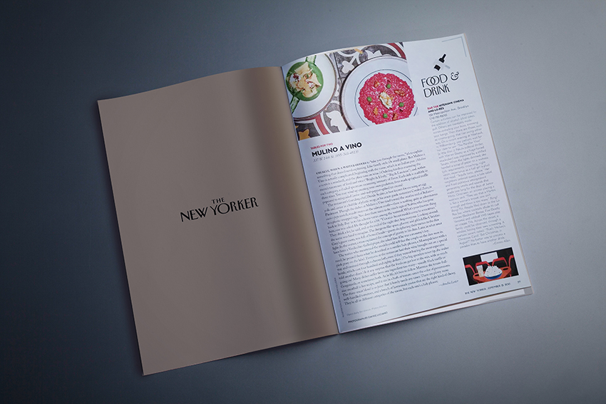
THE NEW YORKER

//MULINO A VINO
New York, USA
September 2015
Con piacere condividiamo il successo di Mulino a Vino NYC, il ristorante italiano progettato da SGS, il cui genio culinario è oggetto di questo articolo sul prestigioso The New Yorker.
Usually, when a waiter offers to “take you through the menu,” it’s to explain something that doesn’t need explaining. Like family style. Or small plates. But Mulino a Vino is actually complicated, beginning with the name, which is an Italian pun. (Mulino a vento is a windmill, and the place runs on wine.) Ordering involves mastering the menu’s taxonomy of food and wine (“Bright & Lively,” “Big & Luscious”), and, within each category, a shaded spectrum measuring intensity of flavor. Each dish is available in three sizes. You may wind up creating your own gradation, from madcap (spiced truffle popcorn) to misguided (anise-and-red-pepper-spiked ice cream). The restaurant’s founding chef, Davide Scabin, is best known for encasing an egg yolk and caviar in a bubble of plastic wrap, at his avant-garde restaurant Combal.Zero, in Piedmont. Though the dishes at Mulino a Vino tend toward the creative end of Italian—cacio e pepe ravioli, wasabi mayo on the salmon confit—there is nothing quite as adventurous as a plastic-wrapped egg. Nor does there seem to be much sign of Scabin, who has gone back to Italy. Buy-in to his scheme varies among the waitstaff. What’s your favorite thing here, one was asked. He thought for a bit. “Victoria’s Secret models come in sometimes.” They drink a lot, he said, and at the end of the night they hug everyone. Looking around, the scene was hard to imagine. The dungeon-like space, gloomy and gilded, like Christian Grey’s guest room, was full of bowed heads—guests deciphering their menus in the dim light. In the corner, a man explained the concept of gravity to his date. Later, in what must have been a Verdicchio-fuelled pique, she asked him if he was a mommy’s boy. The waiter who mentioned the models could tell that the couple on the date were in need; he poured them what he described as a surefire lady pleaser, a Montepulciano with a pink pony on the label. Everyone at the restaurant had their wine brought out on a special tray and strained through a cheesecloth, even if they weren’t buying the most expensive bottle, which cost four hundred and eighty dollars. (The big spenders never tip, the waiter told another diner.) Is it any surprise that the food can get lost in the mix, with so much going on? Many dishes suffer from one ingredient too many—usually black truffle or Gorgonzola, or sometimes both. As in life, it’s best to follow Mamma: the tennis-ball-size meatball is her recipe, and it sits in a bath of tomato sauce the color of persimmons. The three-meat blend is so juicy that it barely needs any sauce. There are plenty more well-handled tomatoes, and a bunch of homemade pastas that are the right kind of chewy. They’re all in different categories of the menu, but each one’s a lady pleaser.
http://www.newyorker.com/magazine/2015/09/21/tables-for-two-mulino-a-vino
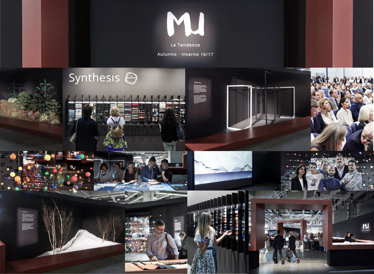
AL VIA LA XXI EDIZIONE DI MILANO UNICA, Salone Italiano del Tessile | SUCCESSO DELL’AREA TREND
// A CURA DI STEFANO FADDA DIRETTORE ARTISTICO CON LA COLLABORAZIONE DI SGS ARCHITETTI ASSOCIATI
MILANO, 8 -10 SETTEMBRE 2015
FIERAMILANOCITY, PORTA TEODORICO
Lo scorso aprile Milano Unica aveva lanciato i trend tessuti … Oggi una piacevole sorpresa, conferma della sensibilità degli espositori ad accogliere ed ad interpretare gli spunti offerti proponendo nuovi accostamenti di colori, materiali e tessuti.
Il racconto è stato affidato a Stefano Fadda – direttore artistico - che con SGS Architetti Associati hanno pensato all’Area Trend come un vero laboratorio creativo, fucina d’idee, che rappresentasse al meglio i mood della stagione Autunno/Inverno 2016 2017 da cui trarre ispirazione.
L’Area Trend – al Padiglione 4 - si presentata quindi volutamente con un nuovo approccio: ripercorrendo il concept espositivo proposto in occasione dell’evento di lancio dei trend di aprile si è sviluppato un percorso sensoriale con quattro mood chiaramente identificati dove paesaggi naturali si alternano a proposte tessuti e materiali talvolta inusuali. Uno spazio aperto dove gli espositori e gli addetti del settore possono liberamente muoversi, soffermarsi, studiare, toccare, valutare…
L’Artic Tale, in cui colline saline evocano un mondo fantastico dall’atmosfera rarefatta e cromatismi glaciali, accoglie le tonalità chiare e calde, dai bianchi chiarissimi, ai colori super light tagliati da colori acquosi e inserti antracite come se fossero specchi di ghiaccio i tessuti sono morbidi. I tessuti sono soffici: lane, piumini, imbottiture, nastri pelosi, fiori di ghiaccio…
Folk Land caratterizzato da un paesaggio che trae ispirazione dalle cromie della terra, con stratificazioni di materiali ed elementi arborei che evocano la natura ed il paesaggio. In parallelo vengono presentati materiali complessi, mix di filati, inserti di frange e soprattutto jacquard, il tutto caratterizzato dalla mano ultra morbida e tonalità calde tipiche della terra.
Il Graphic Wave dove tubolari a sezione quadrata e decori bidimensionali a pavimento e a parete disegnano uno spazio contraddistinto dal forte cromatismo bianco/nero, da giochi geometrici e intrecci di linee che rimandano alle nuove tecnologie digitali. Qui vengono selezionati argomenti di reti, tartan, check, rivisitati in chiave moderna e metropolitana con dei tagli di colore cyan ispirati ad una city del deepweb.
La Play Room dove palline dal mix di colori primari, sostenute da fili trasparenti, generano un effetto ottico dai colori variopinti che richiamano giocattoli vintage in legno, e identificano il gioco, non solo come una attività ma come uno stato d’animo. Blocchi di colore, con tinte estremamente decise, contrasti tra lane cotte, pannolenci e materiali vinili o doppiati sono il tema di questo mood.
In questa edizione gli accessori sono protagonisti tanto quanto il tessuto, per cui è stato deciso di integrarli nel percorso. Infatti in ogni parte si trovano delle sezioni definite in base al colore in cui sono sistemati gli accessori. Non mancano, però inserimenti di nastri e pellicce tra i tessuti, per completare alcune tematiche.
SEGUICI